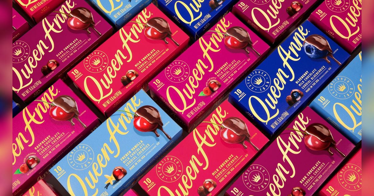
A Modernized Icon Queen Anne, America's leading cordial cherry brand, has unveiled its first comprehensive packaging and visual identity refresh in more than 20 years. The redesign modernizes the brand's look while preserving the equity that has made it a seasonal staple for over 80 years. The updated identity features a refined script logo that maintains recognition while creating a more contemporary expression. The logo now appears in crisp yellow for stronger shelf presence during the competitive holiday season. Each flavor is distinguished through bold, modern color cues, making the assortment easier to navigate while creating greater visual impact. "Our goal wasn't to change what people love about Queen Anne—it was to help them fall in love with it all over again," said Allison Kapp, Vice President of Marketing at Queen Anne. "The new identity celebrates the brand's incredible heritage while expressing it through a more modern lens. We wanted the packaging to capture the feeling of indulgence before consumers ever open the box."
Emphasis on Appetite Appeal Perhaps most notably, the redesign places rich, dripping chocolate and glossy cherries front and center on packaging, reinforcing the indulgent experience inside every box. Gift boxes have also been reimagined with modern ribbon treatments to support seasonal gifting while maintaining premium positioning. Design work was informed by consumer feedback, which showed the refreshed identity maintained recognition and trust among existing buyers while driving stronger perceptions of premium quality, appetite appeal, and purchase interest among prospective consumers. "The opportunity was to evolve an icon without losing its soul," said Chris Cook, Creative Director. "We focused on preserving the visual elements consumers instantly recognize while amplifying what today's shopper responds to most—strong shelf presence, irresistible taste appeal, and a design that feels worthy of giving or keeping for yourself."
New Products Alongside Redesign The visual refresh coincides with product innovations aimed at expanding Queen Anne's footprint beyond the holiday season. This November, the brand will introduce Milk Chocolate Raspberry Cordials, made with real raspberry juice—the first new flavor launched alongside the redesigned packaging. Looking to Valentine's Day, Queen Anne will launch a variety pack featuring four indulgent flavors in a single assortment. The brand also plans to return for its second Easter season, continuing efforts to establish itself as a year-round indulgence rather than a holiday-only tradition. The product formulas themselves remain unchanged, with consumers finding the same recipes and quality that have defined the brand for generations.
Why It Matters
For operators and retailers in the premium chocolate and seasonal gifting space, Queen Anne's refresh signals a broader trend: heritage brands must balance nostalgia with contemporary design and product innovation to attract younger consumers while retaining loyalty. The emphasis on appetite appeal and year-round positioning reflects evolving consumer expectations for indulgence categories.
For more insights and trends in the food and beverage sector, check out more articles in The Food & Beverage Magazine family of publications.
Written by FBM Publications Editors
Frequently Asked Questions
How long has it been since Queen Anne's last packaging refresh?
Over 20 years. This is the brand's first comprehensive packaging and visual identity overhaul in that timeframe, making it a significant move for America's leading cordial cherry brand, which has been in market for more than 80 years.
What's the key visual change to the Queen Anne logo?
The refined script logo now appears in crisp yellow instead of previous treatments, delivering stronger shelf presence during the competitive holiday season while maintaining brand recognition among existing consumers.
How does the new packaging address appetite appeal?
Rich, dripping chocolate and glossy cherries are now prominently featured front and center on packaging, directly reinforcing the indulgent experience inside the box before purchase. Gift boxes received modern ribbon treatments to support premium seasonal gifting positioning.
Did consumer research validate this redesign direction?
Yes. Testing showed the refreshed identity maintained recognition and trust among existing buyers while driving stronger perceptions of premium quality, appetite appeal, and purchase interest among prospective consumers—the dual objective Queen Anne needed to hit.
How are different cordial cherry flavors distinguished in the new design?
Each flavor now uses bold, modern color cues on packaging, making the assortment easier for shoppers to navigate while creating greater visual impact on shelf during peak seasonal selling periods.